
Thursday, April 30, 2015
For Those Who Dare
Training for the Triple Bypass ride this year, I wanted to visualize what it was I'm training for.
Wednesday, April 15, 2015
Dashboard Analogy
Migrated from doesdata.wordpress.com
A couple months ago, my mother told me she still didn’t understand what I do for a living. It isn’t easy to explain the subtle nuances of the IT world let alone the sorcery of queries and scripts. So, I defaulted to the car dashboard analogy. Without the dashboard, it is very difficult to tell how fast the car is traveling, how fast the engine is spinning, how far the vehicle has traveled, or how much fuel is left in the tank. This is a decent analogy to explain the purpose of enterprise dashboard development. They give a quick glimpse into the health of a particular system or process. Although a fine analogy for my mother, it doesn’t really capture what we do.
Mother understood and I’m sure went about telling her friends (who probably think I’m a mechanic, now), but this analogy is flawed. The automotive dashboard does provide key metrics with valuable information answering questions like “Am I out of gas?” and “Am I going to get a speeding ticket?” but this is only point in time information. The dashboard analogy doesn’t really give insight into the vehicles performance.
For example, I can put together a data visualization that shows a count of systems in an environment, but that doesn’t represent the whole picture. Instead or in addition to, a better metric would show the change in system counts over time. Taken a step further maybe these counts are broken into segments or types with trending or forecast information relating to capacity limits.
During a recent Gartner webinar, Jeffery Brooks revealed a better analogy for enterprise dashboards. Sticking with the familiar automotive theme, since most people can relate, he explained that better enterprise or O&I dashboards resemble the dashboard on a hybrid vehicle. These dashboards measure performance instead of point in time metrics. It tells the driver how efficient the vehicle is using its resources, how many miles can be driven with current fuel and battery supply, and can alert a driver to potential hazards.
I don’t think my mother cares about the analogy choice and it serves as a great ten second pitch. But, we need to be conscious of the distinction. Great dashboards show performance and goal adherence, how well a department is using its resources ($$$), potential danger, and (most importantly in my opinion) actionable information

Tuesday, April 14, 2015
Football Championships
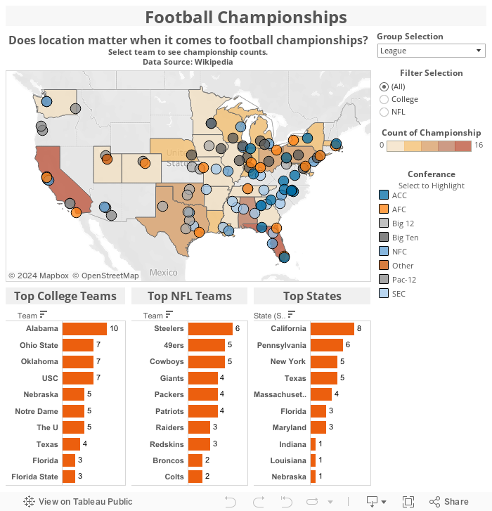
Does location make a difference in Football Championships? Missing football season and testing out Tableau 9.0!!!
Subscribe to:
Posts (Atom)